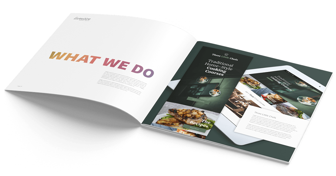
Mobiles have become an indispensable part of life. Our lives are on our phones; we are never not connected to the internet. We have social media, chat messengers and emails open 24/7. As of 2021, more than half of UK internet users access the internet via a mobile phone.
Brands need to be where their customers are, and that is on their phones. Mobile-friendliness is so important that it is a part of Google's SEO criteria. Not only will poor mobile-friendliness affect customer experience, but it will also affect brand and website visibility.
Having a great website is not enough. A site needs to be accessible on every device. A customer's experience should be comfortable, efficient and above all, satisfying.
Do not miss out on engaging with your 'mobile' audience by overlooking these five mobile-friendly website elements.
Scaling down
There is a large variety of mobile devices available, all with different screen sizes and configurations. To improve a sites optics, confirm that the site has HTML5 and CSS codes to scale the site to all devices (when held horizontally and vertically). Check the code being used is not flash, as not all devices can load it, e.g., iPhones. Apple does own a large proportion of the mobile device market. Do not miss out on potential traffic because iPhone users cannot load a page.
Due to the intricacy of HTML5 coding, many businesses hire a web development company to check if their sites are mobile-friendly. This is particularly important for eCommerce companies, who otherwise would effectively be turning away customers at their door.
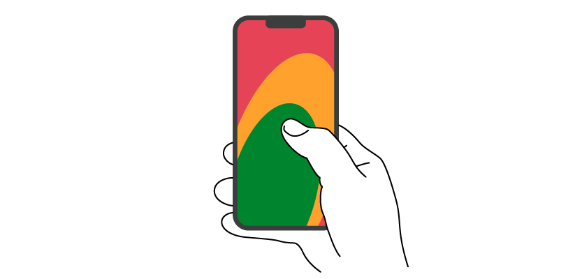
"Thumb zone"
This is one of the key criteria when considering making your website mobile-friendly.
Thumb zoning is a strategy revolving around ergonomic design, based on the science behind how hand placement, grip and digit dexterity optimise customers' experience navigating a mobile-friendly site. Results show that there are three basic grips. Interestingly up to 49% of mobile users grip their phones one-handed.
The Thumb Zone map is defined by:
- First zone – easy to reach area, users have precise digit control. In this zone, customers can perform delicate tasks at ease. Essential call to action (CTA) buttons should be placed here, e.g., the 'add to cart' button.
- Secondary zone – The users control wavers. Detailed tasks can be done but at a strain. Customers can feel physical discomfort from stretching, which can lead to frustration. This zone should be used for essential information that does not need any interaction or less used CTA, e.g., a 'learn more button'.
- Tertiary zone – This zone is outside of the users' digit control. Only irrelevant CTAs should be placed in this zone, e.g., controls to change mode.
Establish and engage customers by subconsciously keeping their engagement within the 'tab-ability zone'.
When using the 'zones' technique, strategise how the audience will navigate. e.g. when navigating through a mobiles menu, the standard is to scroll to rather than 'pinch and zoom' to navigate through information. This is again an ergonomic design. If most users are using one hand, a mobile-friendly site should be navigable with one digit. This is especially important for eCommerce web development.
Thanks to clever mobile-friendly website designers, customers now have aesthetic expectations of what navigating should be. Designs that violate the one-digit rule impeach the comfort and flow of the customer's experience. Poor design such as this is seen as cheap and ineffective. This will have a negative impact on the customer experience. This may also negatively affect a brand’s reputation.
Website development companies that specialise in custom web development can optimise mobile-friendly websites. As a result, a better mobile customer experience will lead to a higher ranking in Google, higher traffic, and ultimately more conversions.
 Slow loading time
Customers have a low tolerance to loading speeds which can result in a high bounce rate. It is an industry-standard that a load time should be no more than 3 seconds.
Load times can be affected by too much information or large images/videos. Effectively a mobile-friendly site is a compressed version of an original website. When reducing in size, the available space for all the information and images is compressed—giving the website the appearance of being congested. What was important information appears as clutter and disregarded in the strain to navigate through the site.
A site needs to be informative, but it can be hard to choose the most relevant aspects.
- Start by prioritising information. Determine why customers are interested in visiting a website by reviewing the top trafficked pages. Audit the information customers are interested in and move it to the front and centre of the site.
- An image (or video) speaks 1000 words, so they say. Conveying information without miles of text is incredibly useful as customers view images more than text on a mobile. However, consider the size and pixel quality of the image so as not to take up precious space. The same premise with videos, they should be kept short and sweet. A video should be under 2 minutes.
- Pop-ups are a brilliant lead generating tool but can slow loading times. However, if poorly designed, they can consume the screen. This will irritate customers who have come to visit the site, not the pop-up.
Keeping it simple
The best Mobile-friendly sites have a minimalist theme. A smaller screen can quickly become cluttered. That being said, a mobile-friendly site should be consistent with the brand aesthetic, stay consistent and clear with the company's positioning.
Easy to read - it sounds simple, but the text on a small screen needs to be a simple design and large enough to read. Stay away from cursive fonts as they are hard to read on a small screen.
CTAs - the point of a CTA is to persuade a customer from considering to decision-making stage. A well designed CTA will generate a higher conversion rate, bringing a company a higher ROI from the website.
Colour palette - a mobile-friendly website must be in keeping with the brand's original site. However, not all colours are user friendly, e.g. neon, which can appear too bright and overwhelm the page. When designing a mobile-friendly site, try sticking to a colour palette. Either complementary or analogous. Consider how a brand is recognised through colour and how it is presented.

Be ahead of the game
Part of being a competitive, successful company is keeping ahead of the competition. This may involve investing in new ideas or checking that the brand is catering to customers in every way they can.
Adding a search bar - When a website has a large quantity of information, navigating it can be complicated. By adding a search function, the customer is provided with an easy way to access the information they are looking for.
Virtual salesperson - When walking into a store, a member of staff will welcome in customers. Their duty is to assist customers and influence them to purchase. A virtual salesperson in the form of a live chat is the same thing. This is a strategy used by many brands but is still not standard practice. A live chat on a mobile-friendly site offers a unique experience of bridging the gap between virtual and reality. Increase customer satisfaction rate by making the customers experience personal with one-to-one chat in real-time.
We hope the pointers above have helped with making your mobile-friendly site. If you need a website design agency to help with upgrading or implementing your mobile-friendly site, please give us a call on 01794 725454 or make an enquiry. We are always here to help.